Latin, Devanagari and
the forms In-between
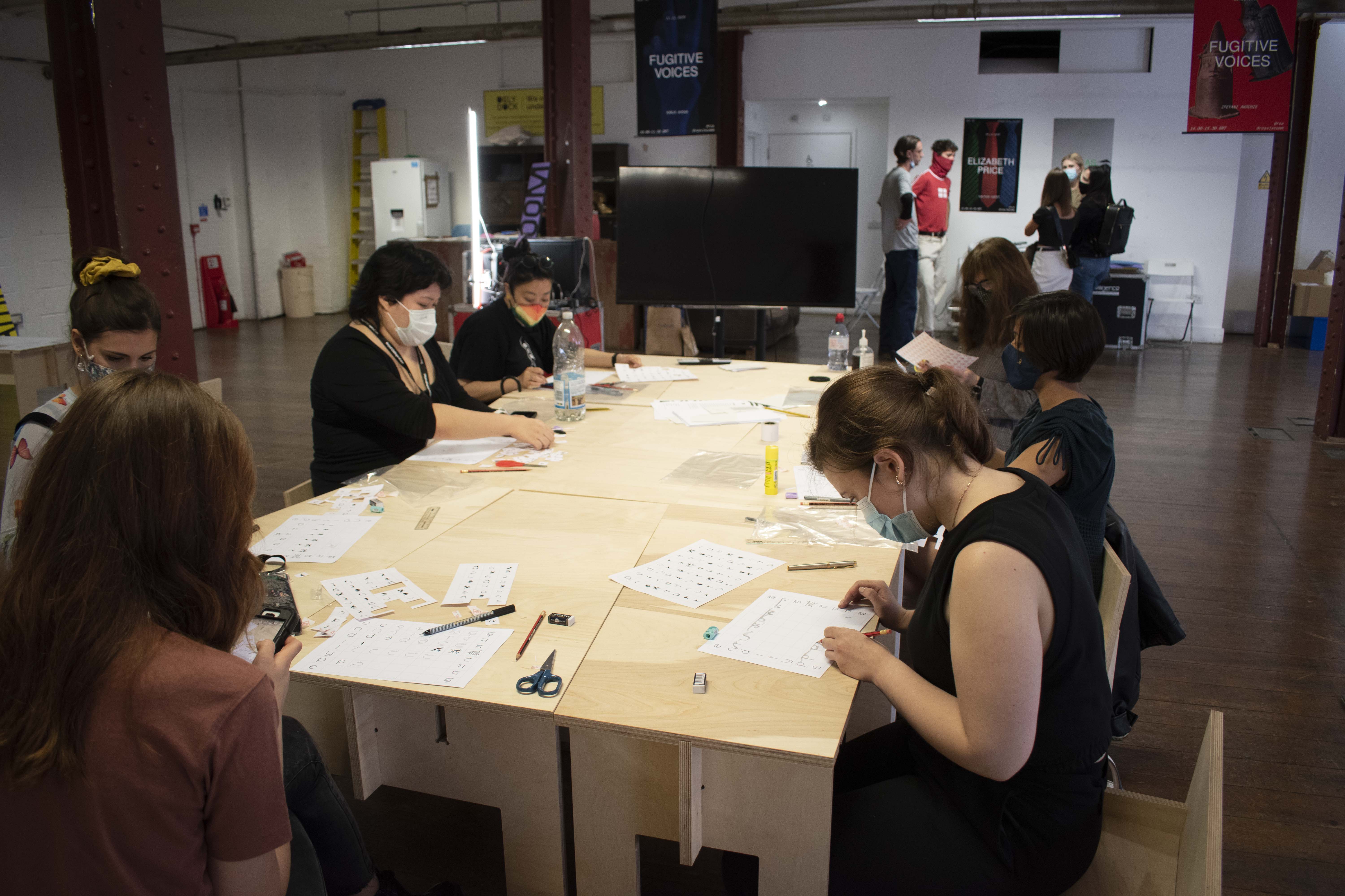
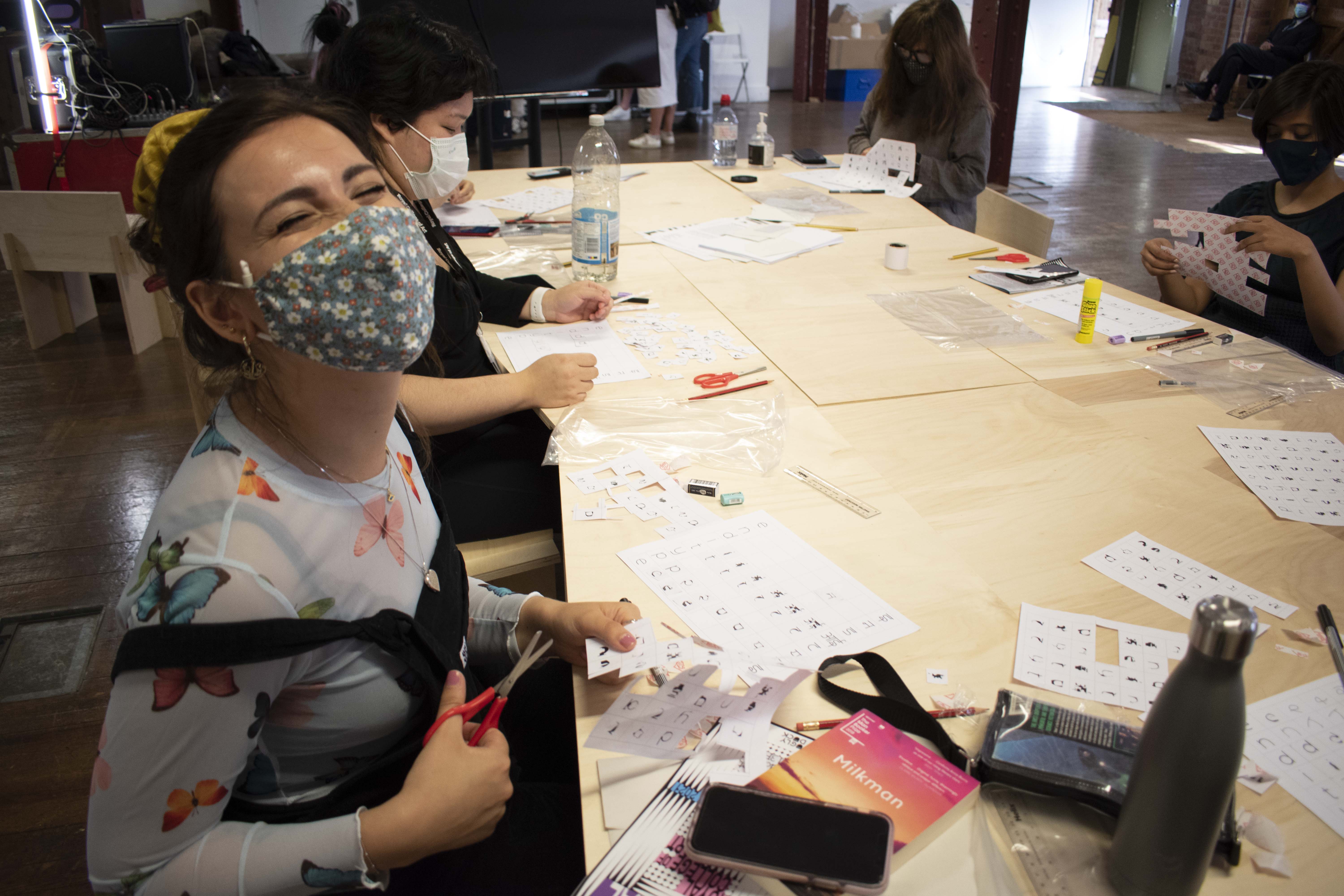
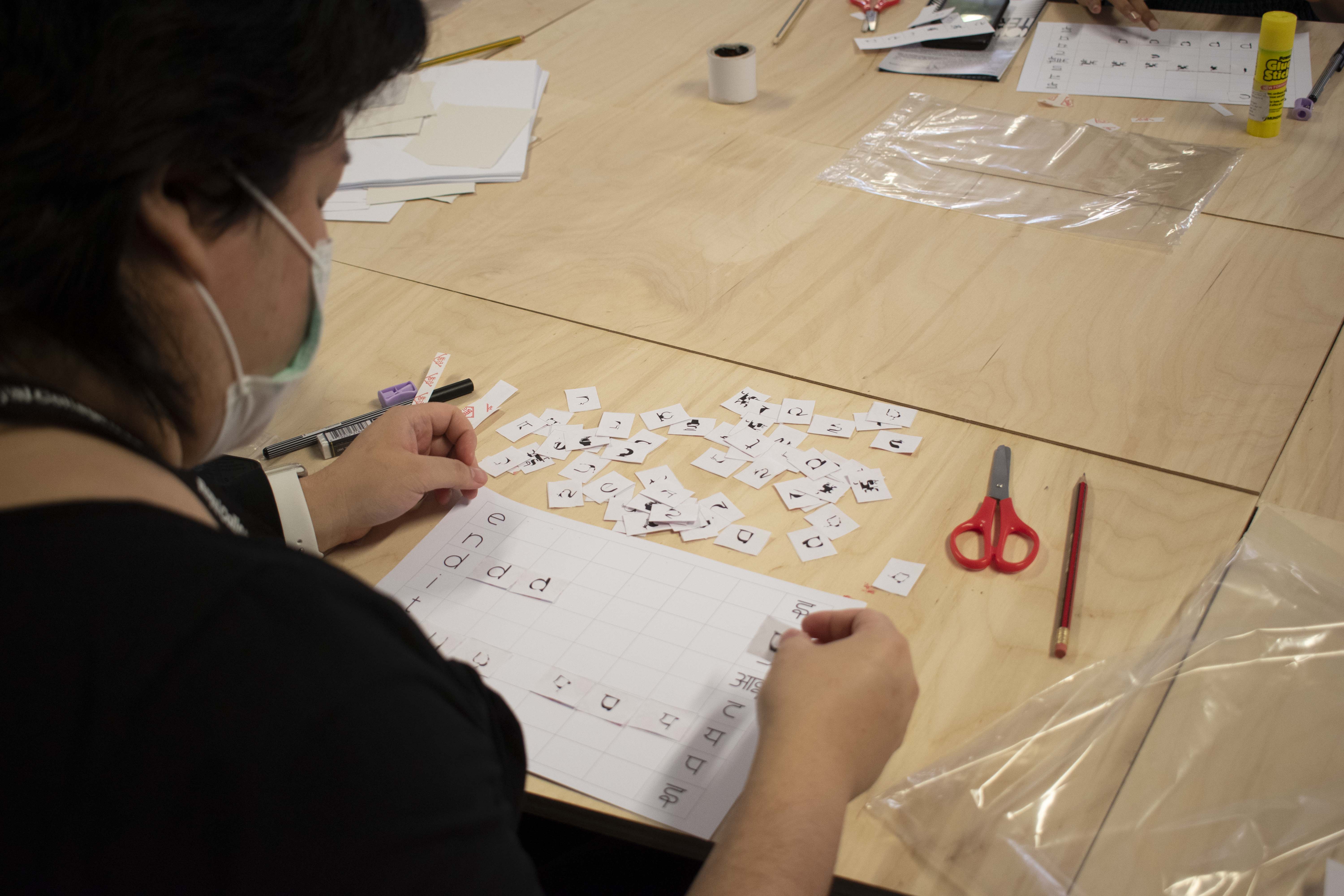
This workshop was essential in understanding how individuals foreign and familiar to these two scripts charted the transitions between the two forms. Keeping the Covid restrictions in mind, each participant was given an individual kit consisting of a card sheet with the base grid with ‘endi type’ written on it, a sticker paper consisting of clues generated from the variable weights in-between the Latin and Devanagari weights of Endi and some stationery to draw and glue them to the card sheet.
The following images of the participants were taken during the course of the workshop.
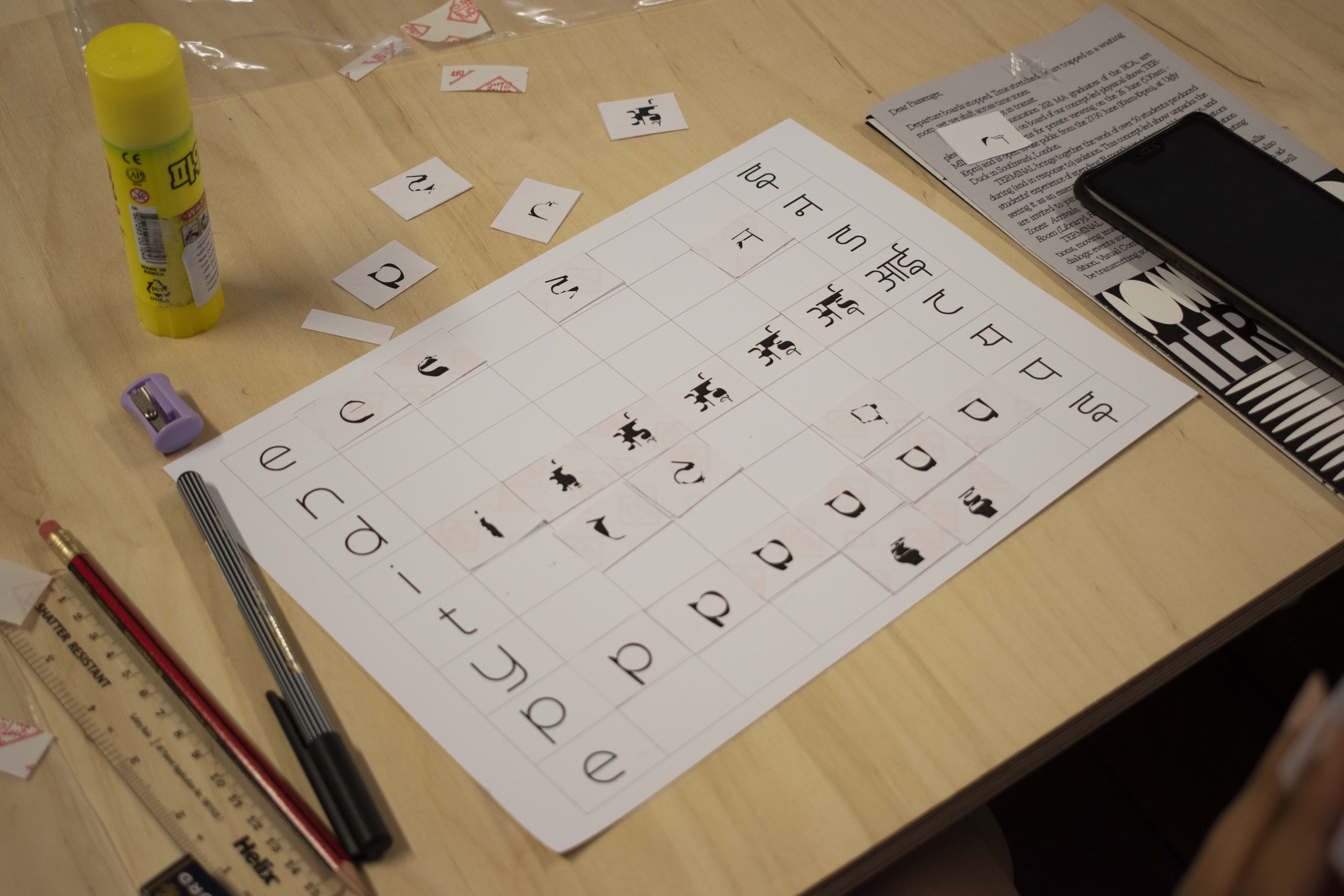
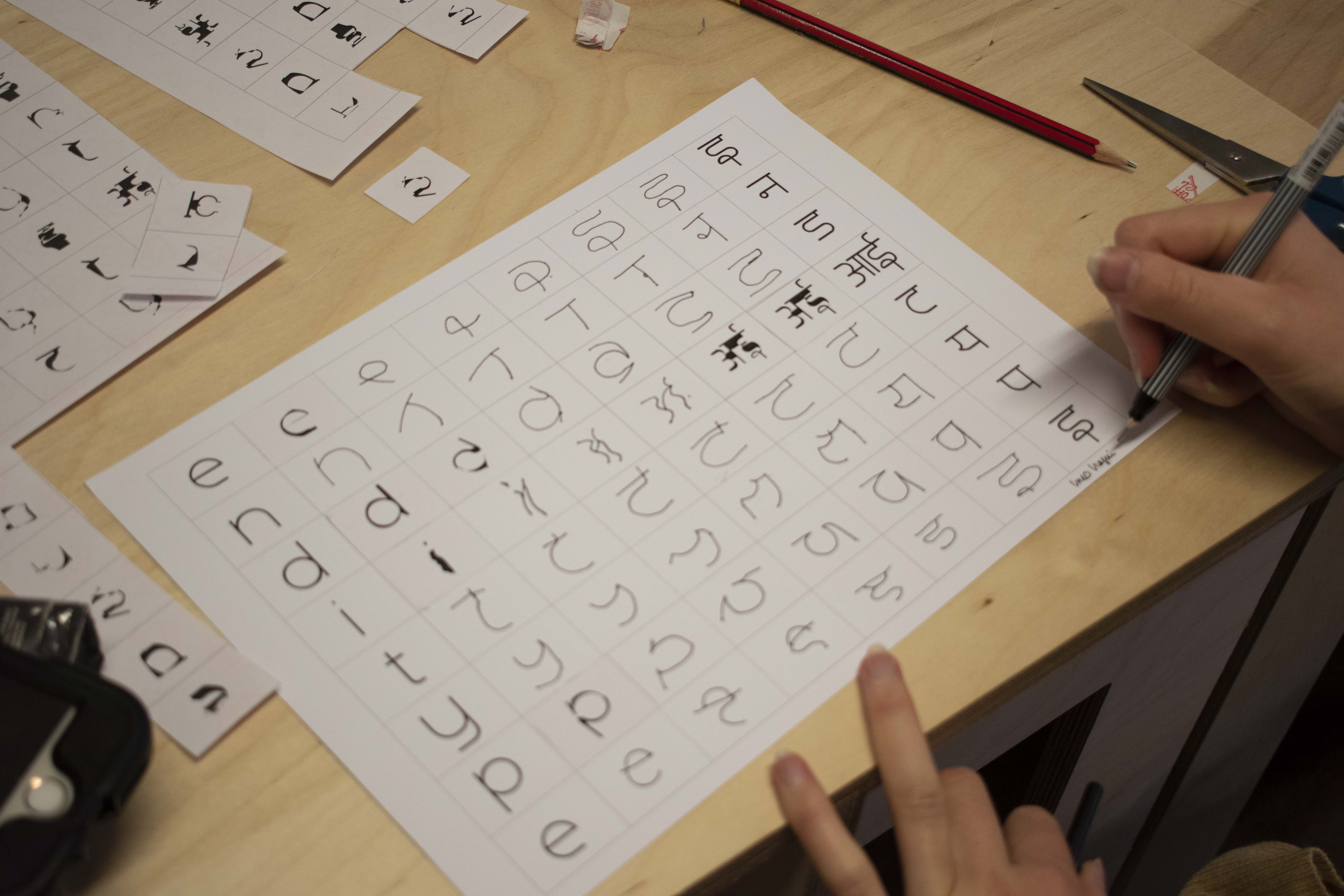
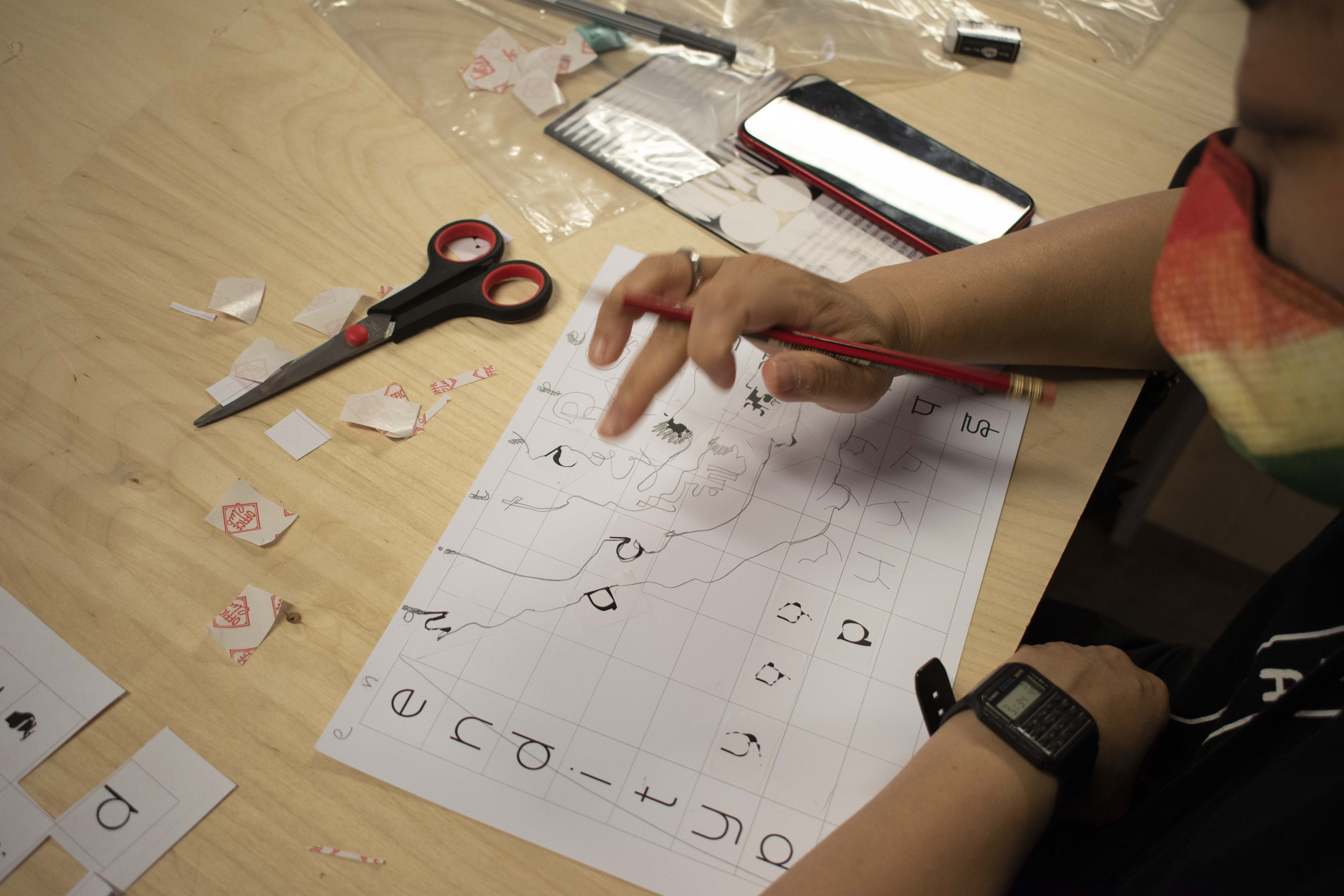
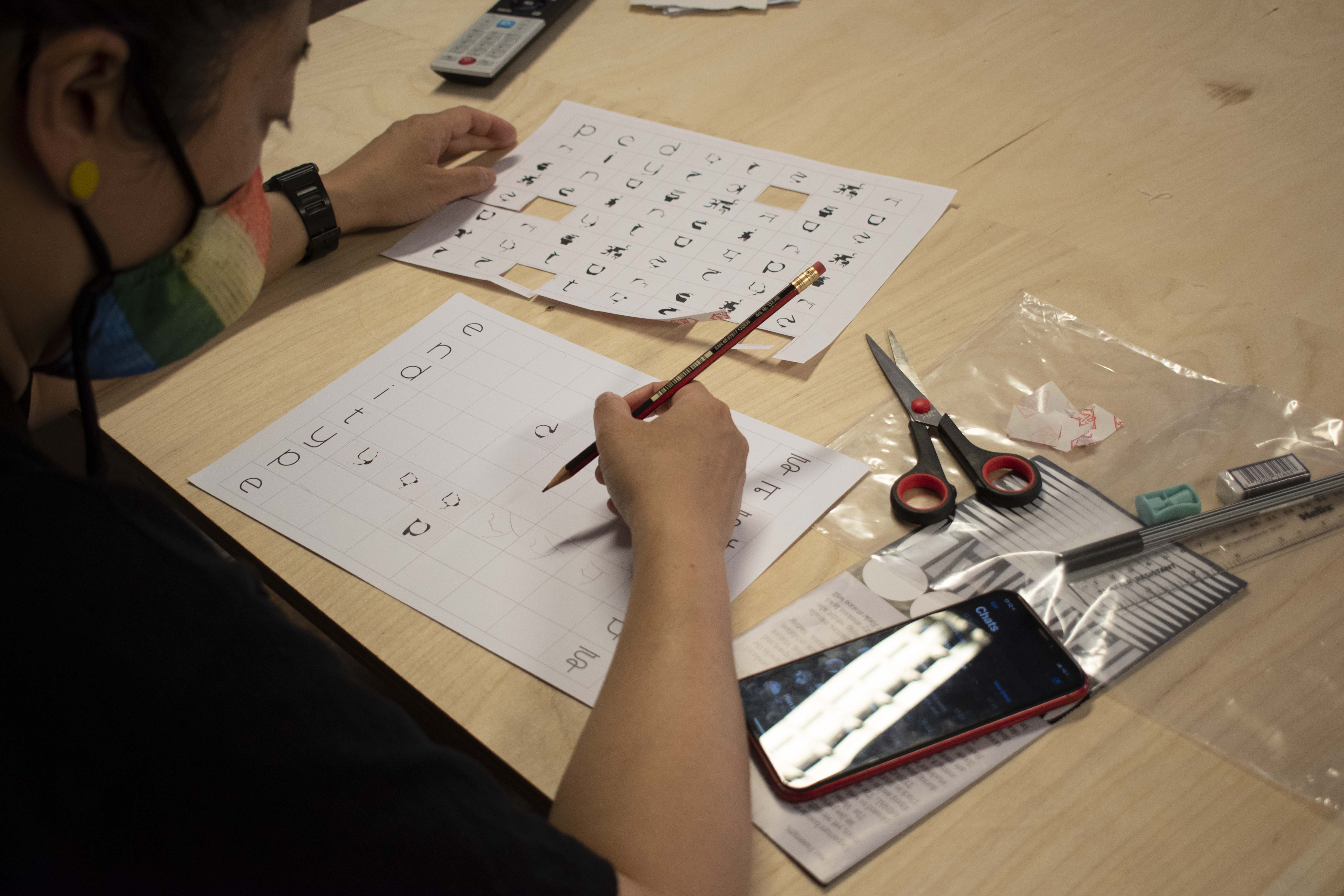
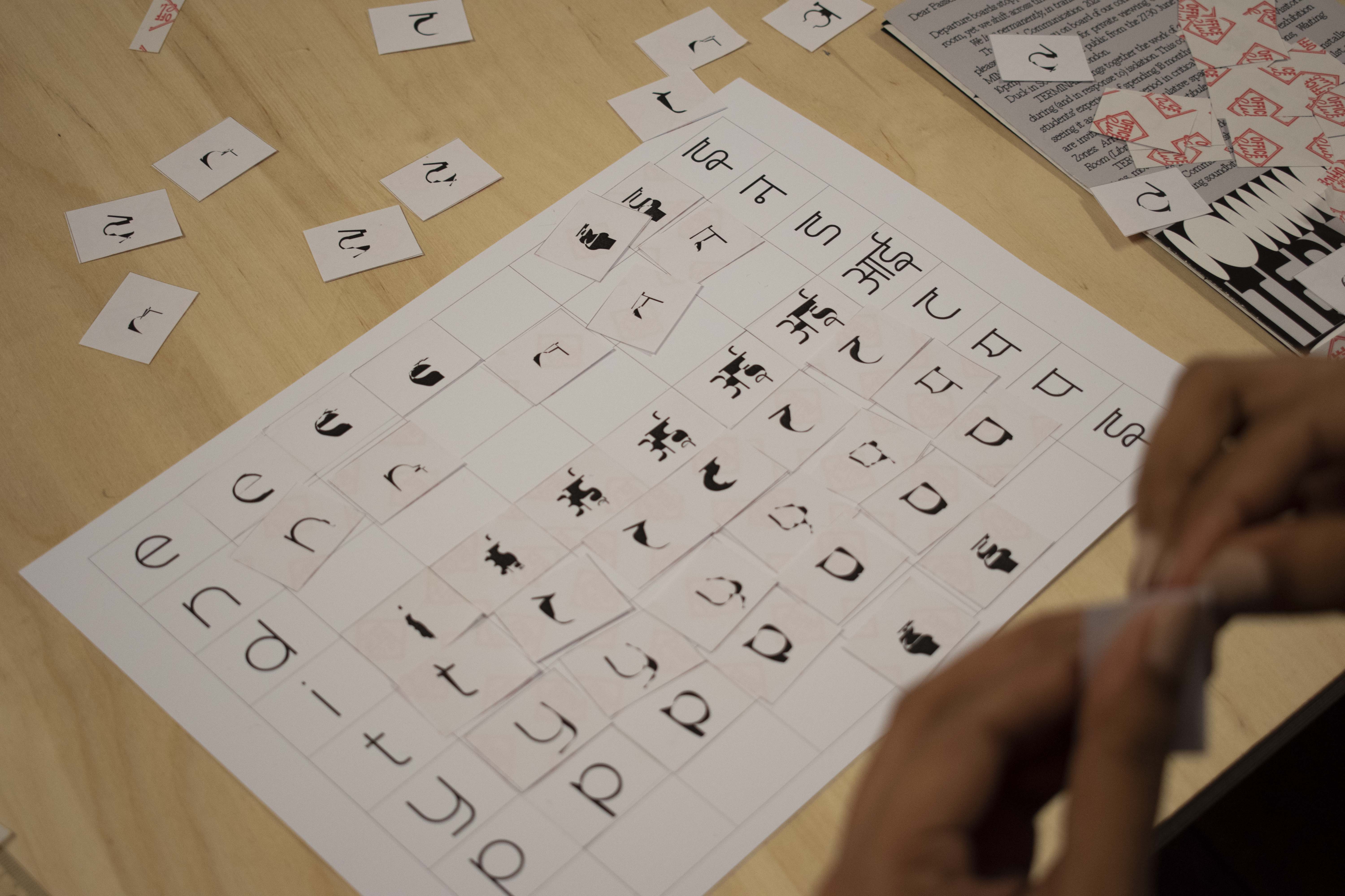
The following are images which represent the transitional forms that participants drew, interpreted or matched using the sticker sheet references, through the workshop. It was interesting to the different approaches that each participant took to envision this translation.

Akshita Sahlot’s Response

Clarisse Hassan’s Response
Hazel Macmillian’s response
Ines Iragui’s response

Kristina Kapeljuh’s response
Suthata Suthmahatayangkun’s response
Yanki Lee’s response
I would like to thank all the 7 participants Akshita Sahlot, Clarisse Hassan, Hazel Macmillian, Ines Iragui, Kristina Kapeljuh, Suthata Suthmahatayangkun and Yanki Lee for participating in this workshop.
By observing these responses and reflecting were integral
Akshita being the only participant familiar with the scripts was able to identify the transition between the forms identical to its digital transition. Inspite of being unfamiliar with the scripts Hazel and Suthata were able to identify the transitions between the forms almost identically through its variable weights with a few exceptions.
Clarisse and Ines approached the transitions by using guides as well as adding to it. It was interesting to see their amalgamated approach and how they envisioned the translation beyond the guides.
Kristina and Yanki imagined the typeface as a trigger and explored the rules of language further. Yanki through her response challenged the direction of left to right horizontal reading to interpret it as a top to bottom vertical direction. She explores the form breaking away from the grid while introducing a new dimension to facilitate transition in between forms.
Kristina illustrates her transitions through the lens of continuity, fragmentation and abstraction. During the digital transition/translation, the movement of the vectors causes the form to alter across the different scripts however it remains continuous. Kristina’s approach is reminiscint of that approach yet has a interpretative illustrative quality to it.
All the participants irrespective of knowing or not knowing Devanagari were able to interact with this typeface and indulge in constructing the forms in-between. It consolidated my belief in the potential of forms to aid translation.
I am extremely curious to experiment with this notion of translation using typography through different mediums and audiences to learn more about this subject. If you would like to collaborate or discuss more on this subject, please feel free to get in touch!